Data Classification
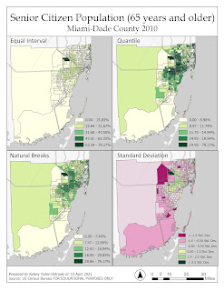
For this week's lab, we were tasked with using four different data classification methods to depict the population in Miami-Dade County. The first set of classifications focused solely on the senior population by percent in each census tract. The second set of maps normalizes the senior citizen population by square mile.
Classification Methods
Equal Interval
This method is the simplest to explain to a layperson. The ranges or subsections
are equal in size. For example, light green is 0-33%, medium green is 34-66%, and dark green is
67-100%. At first glance, this may seem logical, but this method obscures important information regarding the data. We can’t tell how many instances occur within each range or how the variables are dispersed throughout the histogram. Maybe the vast majority of the data falls within the first range. We wouldn't be able to tell with this classification method.
Quantile
This method takes the total number of recorded observations divided by the number of classes, filling each range with an equal number of observations. Even though there can still be variation within each class, quantiles provide a more accurate representation of the data when compared to equal intervals. However, it usually breaks the classes into ranges that are unintuitive to the reader.
Natural Breaks
This method uses the Jenks natural breaks algorithm in order to divide the
recorded observations into similar classes and, thus, minimizing variations within each class. This
method produces an easy-to-understand, yet accurate depiction of the data being presented here.
However, according to Esri, Jenks optimization is not suitable for datasets with low levels of variation. Due to its accuracy, Natural Breaks is the preferable method to demonstrate data.
Standard Deviation
This method of classification looks completely different from the other
three methods for several reasons. The most prominent difference is the diverging color scheme. Standard deviation takes the dataset and creates a bell curve where 50% of the counts fall within one
standard deviation away from the mean. 25% of the counts fall two deviations from the mean, and the
remaining counts fall within the furthest third deviation. This method is difficult to explain colloquially
but it is a useful way to standardize information around a mean. Standard deviation works best with
normally distributed data. As a note, a ramped color scheme could mislead readers into believing the
ranges are an intensity/density scheme.
Normalizing the Data
So all of these schemes are well and good, but the results are useless until we normalize the data. For the second set of maps, we redistributed the number of people 65 years and older by square mile. This provides a common unit of measurement between the data set and the census tracts. I like to think of it in this way: instead of having all of these oddly shaped and varying-sized census tracts, we can redistribute the counts into a regularly sized grid pattern (1x1 mile squares) over the entire county. Once the land is “reshaped” into same-size blocks, we can actually compare how many people are in each space. We can, as they say, finally compare apples to apples.


Comments
Post a Comment