Posts

Showing posts with the label Cartography

Volunteered Geographic Information
Image
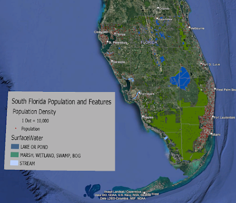
For our last lab, we learned about the fairly new phenomenon of VGI or "volunteered geographic information", which is the generating of new geospatial information via untraditional sources. VGI commonly goes hand in hand with crowdsourcing, geotagging, and big data.  Popular tools for GIS are Google Maps and Google Earth. For this week's lab, we explored using Google Earth by creating our own map and 3D tour. We first created a traditional map in ArcGIS, exported the layer as a KMZ, added additional points of interest, and saved the file as a KML. With this shared data language, information can be shared between major GIS programs.    I'm not personally a fan of Google Earth's "flyby" mode as it reminds me of the early days of computer games. As a consumer of GIS, I prefer Google's Streetview or user-uploaded photography. I feel these better reflect how I experience the world as a human; I don't fly through the world like a drone but walk on the ...
Isarithmic Mapping

Image
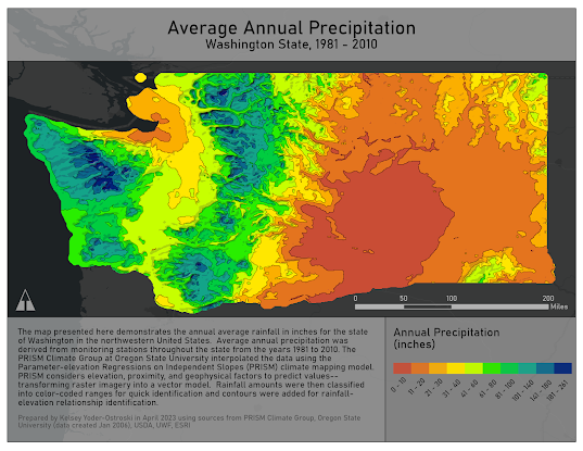
For this week's assignment, we learned about isarithmic mapping, which uses thematic symbology to depict continuous data. As it is impossible to make a record at every point across an enumeration unit, we can use interpolation to make educated predictions. This is commonly done for rainfall, temperature, or elevation by collecting data at control points (either true or conceptual) and then calculating the intermediary points using a method of interpolation. The mapmaker then uses the results, in combination with hypsometric or continuous tinting, to create a map that can help readers find values and patterns between the phenomenon and other geophysical features.  

Choropleth Maps

Image
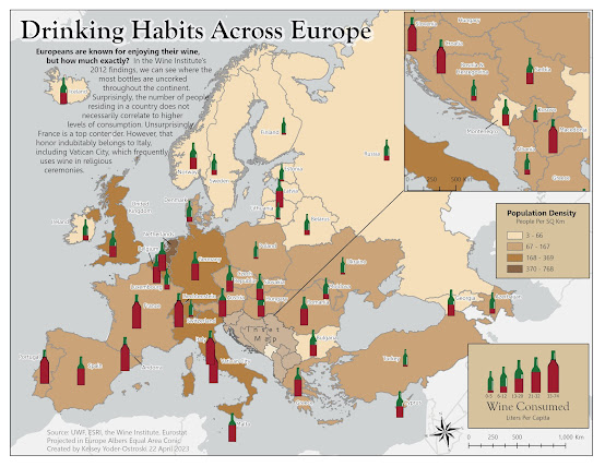
For this week's topic, we learned about choropleth maps as well as graduated and proportional symbology. Choropleth maps are a diverse and popular map style that uses either converging or diverging color schemes over a set of enumeration units. From these color-coded enumeration units, we the readers can discern patterns, make comparisons, or identify areas of change. So what does that look like? Well, pop open your favorite bottle of wine because for this week's lab we created a thematic map that demonstrates European population density and wine consumption.  For my map, I looked for inspiration from my favorite box of wine (yes, box, go ahead and judge). The earthy browns provide a visually stable background for the dark red and green of the wine bottle symbology. Instead of the traditional circle, I chose wine bottles with increasing fullness and size to represent the quantity of wine consumed. This reinforces the thematic message and makes the map visually interesting. A br...

Data Classification

Image
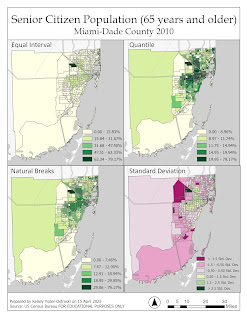
For this week's lab, we were tasked with using four different data classification methods to depict the population in Miami-Dade County. The first set of classifications focused solely on the senior population by percent in each census tract. The second set of maps normalizes the senior citizen population by square mile.   Classification Methods Equal Interval This method is the simplest to explain to a layperson. The ranges or subsections are equal in size. For example, light green is 0-33%, medium green is 34-66%, and dark green is 67-100%. At first glance, this may seem logical, but this method obscures important information regarding  the data. We can’t tell how many instances occur within each range or how the variables are dispersed  throughout the histogram. Maybe the vast majority of the data falls within the first range. We wouldn't be able to tell with this classification method. Quantile This method takes the total number of recorded observations divided by the...

Cartographic Design

Image
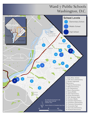
For this week's module, we were tasked with creating a map depicting public schools in Ward 7 of Washington, D.C. We focused on cartographic design which includes elements of visual hierarchy, contrast, figure-ground relationship, and balance. Our goal was to produce a beautiful and informative map according to these principles.  Visual Hierarchy As the most important visual and thematic element, the study area dominates the map document. The distinct border separates the figure-ground from the study area, which is a light gray. The second most dominant element is the blue symbology of the ranked schools (elementary, middle, and high). These blues pop against the gray study area and are the largest symbols on the map. The legend and title are the next elements which are close together in the upper right corner. The title, which is the largest text, succinctly describes the thematic message. A locator map occupies the negative space in the northwest corner, providing context to the ...

Typography

Image
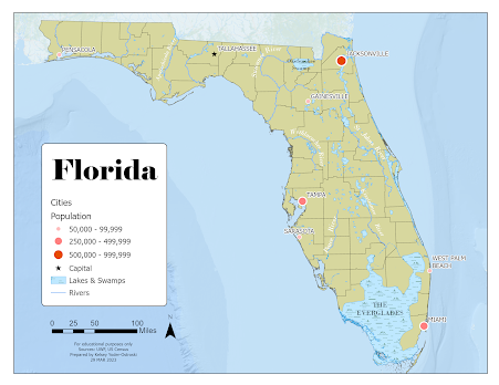
For our second module in GIS5007, we were tasked with creating a map of Florida with a requite list of features. These included county boundaries, several major cities, and a handful of important rivers. For this map, I used Esri ArcGIS Pro and a provided global database. I focused on presenting a visual hierarchy that highlighted the requisite map elements in a conventional and visually pleasing manner. For the major cities, I chose to use an ordered rank symbology with the smallest city represented with a light, small circle, the middle-sized cities with a medium size and shade, and the largest cities with the largest and darkest symbol. The capital of Tallahassee is differentiated with a small black star. Additionally, the cities are labeled in a sans-serif font to distinguish them from natural features. They also have a white shadow to aid in readability. The cities should probably have just the beginning letters capitalized as that is the more conventional type setting.  I cho...

Map Critique

Image
     For this week's lesson, we were tasked with finding, selecting, and critiquing two maps- one as an example of a "good map" and one as an example of a "bad map". We had to justify our critique by discussing the various map principles and how each map executed the various "Tufteisms". We evaluated each map's use of cartographic design in its attempt to convey substance in an aesthetically pleasing and logical way. Example of a "Good Map"     Source      For my example of a good map, I chose a cartogram from ESRI's showcase gallery. It is not a traditional map but it uses a cartogram to depict the quantity and density of breweries in countries across the world. It uses simple symbology to quickly convey data; the audience can quickly decipher where the largest quantity of breweries are located through the use of size and color. Further information is provided in smaller subtitles and subtext, which is also color-coded. The cartogram...

Welcome to GIS 5007 Spring 2023

Image
My name is Kelsey Yoder-Ostroski and I am a new(er) student in the world of GIS. This is my third class in UWF's GIS Admin graduate program as a full-time student. At the moment I am a caregiver to our kids but I also do volunteer work with a nonprofit providing support to local moms. We are a military family; we have lived in the Navarre area for 3 years and are preparing to move to Germany this summer. I'm not ready for the cold! I am originally from Texas so I love the heat, but we can't wait to see everything Germany and its neighbors have to offer.  In my free time, I enjoy learning German, baking (mostly breads), or doing home improvement projects. I have a weakness for cookies and power tools.  I am pursuing a master's in GIS business administration because I love how applicable and versatile it is. It literally encompasses every topic on Earth from the land to its resources and to all of history. I'm not 100% sure what I will do after graduating but I am int...