Typography
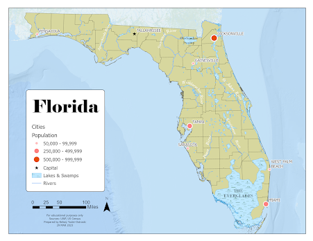
For our second module in GIS5007, we were tasked with creating a map of Florida with a requite list of features. These included county boundaries, several major cities, and a handful of important rivers. For this map, I used Esri ArcGIS Pro and a provided global database. I focused on presenting a visual hierarchy that highlighted the requisite map elements in a conventional and visually pleasing manner.
For the major cities, I chose to use an ordered rank symbology with the smallest city represented with a light, small circle, the middle-sized cities with a medium size and shade, and the largest cities with the largest and darkest symbol. The capital of Tallahassee is differentiated with a small black star. Additionally, the cities are labeled in a sans-serif font to distinguish them from natural features. They also have a white shadow to aid in readability. The cities should probably have just the beginning letters capitalized as that is the more conventional type setting.
I chose traditional blue symbology for rivers and blue/green symbology for lakes and swamps. Rivers are labeled using an annotation layer, which allows for the customized arrangement along the river features. These are labeled using a white serif font while the swamps are labeled in black.
The basemap is a bathymetric map provided through the ArcGIS program. I screened the basemap with a semi-transparent blue to push it further away from the reader. This gives the map background some interest in terms of texture while also providing information to the reader that Florida is surrounded by water and is contingent to land on its northern border.


Comments
Post a Comment