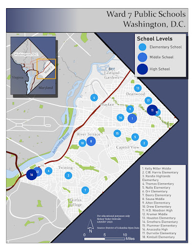
For this week's module, we were tasked with creating a map depicting public schools in Ward 7 of Washington, D.C. We focused on cartographic design which includes elements of visual hierarchy, contrast, figure-ground relationship, and balance. Our goal was to produce a beautiful and informative map according to these principles.
Visual HierarchyAs the most important visual and thematic element, the study area dominates the map document. The distinct border separates the figure-ground from the study area, which is a light gray. The second most dominant element is the blue symbology of the ranked schools (elementary, middle, and high). These blues pop against the gray study area and are the largest symbols on the map.
The legend and title are the next elements which are close together in the upper right corner. The title, which is the largest text, succinctly describes the thematic message. A locator map occupies the negative space in the northwest corner, providing context to the study area.
The reader can find additional information in smaller text throughout the document, including the numbered symbols and corresponding school directory, neighborhoods, and other landmarks. The smallest text is reserved for technical information such as the data source, author, and disclaimer.
Contrast
By using contrast, the study area is at the forefront of the map and the chosen points of interest are highlighted. The same blue is used throughout the document but in vastly different values. The darkest color is reserved for the background, which provides no information. The three chosen symbols contrast brightly against the light gray but remain distinct due to their ramping sizes and color value.
Major roads are dark red, which is an opposing color to blue. Minor roads are pushed further back visually with a simple white scheme.
Figure-Ground
A figure-ground is established through contrast. The study area is the lightest, most detailed area, the non-study area is slightly darker with less information, and the background is the darkest and simplest. The area of focus is also in the center of the document and the negative space of the background is filled in with additional information.
Balance
Balance is created through the visual hierarchy. The most important elements are largest and centralized while additional information is provided in smaller text placed in negative space around the study area. Additionally, the title's background provides counter-shading to the map.


Comments
Post a Comment