Choropleth Maps
For this week's topic, we learned about choropleth maps as well as graduated and proportional symbology. Choropleth maps are a diverse and popular map style that uses either converging or diverging color schemes over a set of enumeration units. From these color-coded enumeration units, we the readers can discern patterns, make comparisons, or identify areas of change.
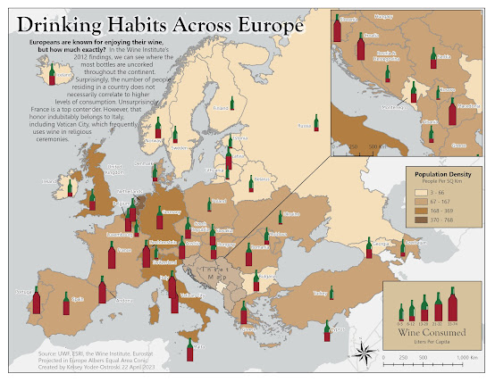
So what does that look like? Well, pop open your favorite bottle of wine because for this week's lab we created a thematic map that demonstrates European population density and wine consumption.
For my map, I looked for inspiration from my favorite box of wine (yes, box, go ahead and judge). The earthy browns provide a visually stable background for the dark red and green of the wine bottle symbology. Instead of the traditional circle, I chose wine bottles with increasing fullness and size to represent the quantity of wine consumed. This reinforces the thematic message and makes the map visually interesting. A brief synopsis provides context as well as fills the negative space in the top left corner, which is the natural starting point for reading. It also creates a visual bridge between Iceland and the rest of Europe. Overall, I went with a more human-interest piece direction with my map as I thought the topic is similar to something you might see in National Geographic or in a tour guide.
The most challenging aspect of this map was grappling with ArcGIS Pro's limited symbology editing. The wine bottle graphics were edited in Adobe Illustrator and imported as a .SVG file, which were then used as the graduate symbols for liters of wine consumed per capita. The shape of the wine bottles and the number of enumeration units (countries), initially made the map look cluttered. Ideally, I wanted to be able to pick up each wine bottle and manually adjust the location to a more visually pleasing location. However, I was not able to convert the symbols into a graphic or annotation layer. Since I could not adjust the wine bottle symbology, I adjusted the country name labels and the individual symbology anchor points to the best of my abilities. In the future, I may consider manually adding the symbology layer as graphics, and I will definitely be exploring Adobe Illustrator further.


Comments
Post a Comment