The Importance of Typography
The Importance of Typography
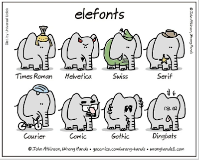
Or why Times New Roman is so last Century Gothic
Alternatively, what the Helvetica is going on with fonts?
So this is going to sound kooky, but fonts have personality. No, not fronts or fronds or fondue-- fonts. You probably remember your teacher telling you, "Only use Times New Roman or you'll never get into college!" Yes, the thing you probably can barely describe but completely surrounds you in print media. It's on your favorite bag of chips, your comfy sweater, and on the computer screen right in front of you.
Font, or typography, is the purposefully and carefully chosen craft of choosing how words and symbols appear in print media. It conveys personality and purpose. It taps into the Jungian archetypes-- from heroic to villainous, from analytical to whimsical, and to everything in between.
Cartographers employ the same skills in order to communicate effectively. Just like there is an infinite variety of advertisements, there is a wide array of map styles-- each with their own unique way of communicating.
When you say the word "map", most people's first thought is of a road map. These are your standard documents depicting an area; they usually show roads, large geographic features, and other important points of interest. Below is an example of a reference map that I created for the city of San Francisco.
As you can see, it has all of the standard elements of the typical map: blue stuff is for water, green is for forestry, and black is for roads. However, the focus of this map is the typography. As stated earlier, typography is the processing and artful rendering of text to convey understanding.
Typography is more than just reading the words. It's processing the text size, placement and l e a d i n g , color, shadow or halo, and overall style.
Even with something as simple as a road map, each text is carefully chosen to tap into previous experience, expectations, and general knowledge. So let's go over some of the key text elements here and how they achieve just that.


Comments
Post a Comment