Visualizing Terrain in ArcGIS Pro
Visualizing Terrain in ArcGIS Pro
Ever hear the joke about the topographic map? It was hill-arious!
As stated in my last blog post, the world is not flat but traditional mapping is. So how do we go about translating 3D objects into a 2D space?
Terrain visualization is the process of representing either the physical characteristics of the terrain or phenomena occurring at that location. The goal is to provide a visual and intuitive understanding of a specific area's topography and landscape features. Frequently slope and elevation, rainfall, and landcover are recorded and symbolized in various methods. By combining recorded measurements with location and elevation, we can analyze possible patterns and make more accurate predictions.
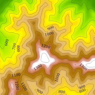
Contour lines are lines on a map or a two-dimensional representation that connect points of equal elevation above a reference point, usually sea level. These lines help visualize the shape and relief of the land, indicating changes in elevation across a landscape. Each contour line represents a specific elevation, and the spacing between the lines indicates the steepness of the terrain: closer lines indicate steeper slopes, while more widely spaced lines suggest flatter areas.
Contour lines form a contour map or topographic map, providing a detailed representation of the three-dimensional features of the Earth's surface. By studying contour lines, individuals can gain insights into the terrain's characteristics, identify hills, valleys, ridges, and other landforms, and plan routes for activities like hiking or construction. Additionally, contour lines are essential for geologists, environmental scientists, urban planners, and others who require accurate spatial information for their work.
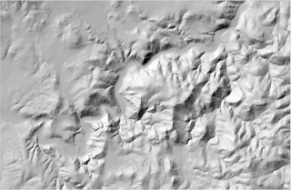
Contour lines have a long history, but with modern computers we can also render the landscape with hillshading. Hillshading is a cartographic technique used to visually represent the three-dimensional terrain of a landscape on a two-dimensional map by simulating the effects of sunlight and shadows. The goal is to enhance the perception of elevation and relief in a map, providing a more realistic and intuitive understanding of the topography.
In a hillshade representation, each pixel on the map is assigned a shading value based on its orientation to a simulated light source. The areas that face the light source receive more illumination and appear brighter, while the opposite sides, in shadow, appear darker. This creates a visual effect that mimics the way sunlight interacts with the natural contours of the terrain.
Traditional hillshading can appear harsh and frequently obscures steep features. We can overcome this obstacle with multidirectional lighting. Less intense lighting fills areas of shadow, allowing us to see into ravines, cliff faces, and canyons better. I like to think of it as providing mood lighting to a scene.

Combining hillshade visualization and thematic elements produces dynamic, informative maps.
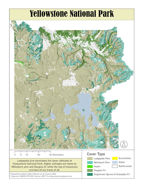
This map I created represents the various tree species found in Yellowstone National Park. By combining hillshade to the area, we can start to see patterns of tree growth and elevation. Longpole pines dominate the lower basin surrounding the lakes (traditional blue) whereas we see more variation in the upper mountains. However, at the uppermost elevations, there is no tree growth at all. Instead, we see the white symbology of snowy peaks.
For this map, I chose colors that would reflect the subject matter: natural browns, greens, and blue. For the smallest areas, I chose bright colors that would hopefully make finding these outliers easier to spot. After all, we are trying to see the forest for the trees.
The representation of terrain, whether in three-dimensional models or two-dimensional maps, provides crucial insights into the physical characteristics of a geographic area.

Comments
Post a Comment