Playing with Color
Playing with Color
It's a very serious business
Creative Commons
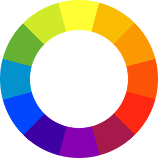
Oh, hello first grade color wheel.
Why are you here? I thought we were in grad school?
Oh, you're here to completely disillusion me from the notion that I know what color is?
Cool.
Color is an important aspect of cartography that often goes unnoticed by the majority of readers. However, color choice plays a critical, unspoken aspect of design and messaging. We can look at color through the Jungian lens: white is pure, red is bold and bloody, green is growth and life, and so on. The meaning of color is dependent on culture and historical trends.
But what about the scientific approach to color? Color is our human perception of the electromagnetic spectrum. We are seeing the absorption, reflection, and interference of light. Our interpretation of these wavelengths is affected by vision, light, and cultural understanding.
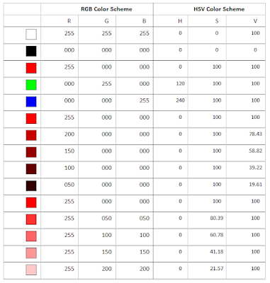
Naming paint in the hardware store "Canyon Dusk" and "Moondust" is one way of describing color. However, there are more procedural ways of categorizing colors. One key method is by calculating the amount of red, green, and blue in a color (RGB) while the other is by defining the color by its hue, saturation, and value (brightness). I probably don't have to explain what the colors red, green, and blue mean. Hue is color, saturation is the pureness of the color, and value is the brightness level.
A fantastic way to convey information and display patterns is through choropleth maps. These are a type of thematic map that depicts some sort of characteristic of a geographic location. Commonly mapped data includes voting patterns, population density, and land type. How color is used is dependent on the message intended to be conveyed.
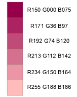
According to Esri, color ramps are a "continuous success of colors... to show ranking or order". There are several methods of creating color ramps. The simplest method is a linear progression. Each color is adjusted with the same interval. Think of it as steps down or up. The major problem with linear progression is that humans have a hard time perceiving the differences between darker hues.
Linear Progression
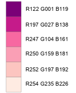
Another option is the free program ColorBrewer by Dr. Cynthia Brewer.
Whew, that is a lot easier. Linear (or sequential) color ramps are commonly used to denote density. Below is my population density map for the Hispanic population per county in Texas using data from the 2000 US Census. Darker blue indicates a higher percentage while each successive color represents decreasing density. Each map represents different ways to classify density: natural breaks, equal intervals, and quantiles. For more information about data classification, check out my other post.
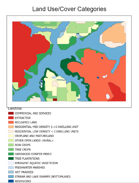
The next map is a land use/ land cover (LULC) map, which uses a qualitative color scheme. Qualitative color schemes use color to represent data with no inherent order. The colors don't indicate more/less or increase/decrease. Each color represents a different classification. For this map, similar classifications are given similar colors. Red is for human-related activity, green is for plants, and blue is for water or water-based vegetation. Hue remains the same within each category for easy identification. Saturation and brightness were adjusted within each category to differentiate each class.
The last map presents changes in population by county in the state of Colorado. Data compares population change from 2014 to 2010. Because our data represents information from opposite sides of the spectrum, a diverging color ramp is appropriate. Dark red represents a decline in population while dark blue denotes an increase. A neutral color was chosen as the median to depict little to no change. Intermediary classes were provided with decreasing hues. The percentages are classed using Jenks Natural Breaks. This method groups similar classes together in a way that minimizes variations within classes. The legend was edited with the word "to" instead of a dash for clarity.
Have fun coloring!




Comments
Post a Comment