Proportional and Bivariate Maps
Proportional and Bivariate Maps
Representing multiple variables in a single design
Proportional Maps
Often we will need to represent quantitative data. Proportional (often called graduated) symbol maps are an intuitive method of displaying quantities. By using ratios, we can show a range of symbols to indicate quantity or importance. However, creating an effective proportional map can be challenging due to overlapping symbols and the human tendency to over or underestimate size.
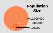
The following map depicts the population size of major cities in India. I chose a proportional (or graduated) symbology of three sizes for this map. Circles are a common symbol for point classes and each circle represents a magnitude of class (population) size. Since humans have a difficult time discerning the differences between shape size, it is important to choose symbols that will be easy to interpret. Small, medium, and large are intuitive to most readers.
The major challenge of this map was determining a way to situate the symbols so all cities were represented. I chose to make the symbols semi-transparent. When the symbols overlap, they create a darker shade while still allowing the reader to see all symbols. I also created labels with thick white shadows for readability. These labels also highlight the smallest cities, almost specks on the map.
Proportional Maps with Positive and Negative Values
An additional challenge of proportional maps is representing negative values. To overcome this, we can use differing colors. In this example, green is an intuitive color for growth while red is commonly inferred to be negative. As with the previous map, I used a ratio of various sizes to indicate quantity. Job growth has four symbols while job loss only has three. I wanted to keep each legend as similar as possible for easy comparison, so each class size is the same.Each symbol has a thin dark border to help distinguish it from the background. The background is a two-tone gray scheme with states of positive values in dark gray and states with negative values in light gray. This additional scheme aids in distinguishing the two state classes. I did not use transparency in this map as there was little overlapping. For classes that did over lap, I placed the smaller of the symbols on top of the larger.
Legend Closeup
Bivariate Choropleth Maps
The last map type for this module is a bivariate choropleth map. A bivariate choropleth map is a type of thematic map that displays two different variables simultaneously for geographic regions. Each region is shaded or colored according to the values of the two variables being represented. This type of map allows viewers to visually compare the relationships between the two variables across different geographic areas. Typically, bivariate choropleth maps use a combination of color hues, shades, or patterns to represent the values of each variable, with different combinations of colors or patterns indicating different combinations of values.
ArcGIS Pro does not yet have a bivariate choropleth tool, so I had to prepare the data in a way that would be understood by the program. The two chosen variables are first reclassed. Obesity percentages were sorted into three quantiles, added to a new field in the attribute table, and reclassed using SQL. These new classes were given A, B, or C. The same was done for the second variable of inactivity percentages but with a new class of 1, 2, or 3. The two new reclassed variables were then combined in an additional field for a final output of nine possible classes (A1, A2, A3, etc). Each of these new classes represents the combined options of activity levels and obesity levels.


Comments
Post a Comment