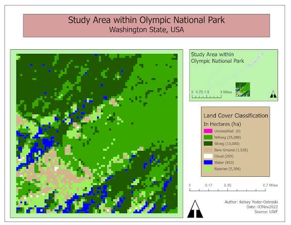
Posts

Typography

Image
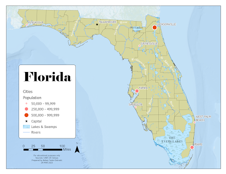
For our second module in GIS5007, we were tasked with creating a map of Florida with a requite list of features. These included county boundaries, several major cities, and a handful of important rivers. For this map, I used Esri ArcGIS Pro and a provided global database. I focused on presenting a visual hierarchy that highlighted the requisite map elements in a conventional and visually pleasing manner. For the major cities, I chose to use an ordered rank symbology with the smallest city represented with a light, small circle, the middle-sized cities with a medium size and shade, and the largest cities with the largest and darkest symbol. The capital of Tallahassee is differentiated with a small black star. Additionally, the cities are labeled in a sans-serif font to distinguish them from natural features. They also have a white shadow to aid in readability. The cities should probably have just the beginning letters capitalized as that is the more conventional type setting.  I cho...

Map Critique

Image
     For this week's lesson, we were tasked with finding, selecting, and critiquing two maps- one as an example of a "good map" and one as an example of a "bad map". We had to justify our critique by discussing the various map principles and how each map executed the various "Tufteisms". We evaluated each map's use of cartographic design in its attempt to convey substance in an aesthetically pleasing and logical way. Example of a "Good Map"     Source      For my example of a good map, I chose a cartogram from ESRI's showcase gallery. It is not a traditional map but it uses a cartogram to depict the quantity and density of breweries in countries across the world. It uses simple symbology to quickly convey data; the audience can quickly decipher where the largest quantity of breweries are located through the use of size and color. Further information is provided in smaller subtitles and subtext, which is also color-coded. The cartogram...

Welcome to GIS 5007 Spring 2023

Image
My name is Kelsey Yoder-Ostroski and I am a new(er) student in the world of GIS. This is my third class in UWF's GIS Admin graduate program as a full-time student. At the moment I am a caregiver to our kids but I also do volunteer work with a nonprofit providing support to local moms. We are a military family; we have lived in the Navarre area for 3 years and are preparing to move to Germany this summer. I'm not ready for the cold! I am originally from Texas so I love the heat, but we can't wait to see everything Germany and its neighbors have to offer.  In my free time, I enjoy learning German, baking (mostly breads), or doing home improvement projects. I have a weakness for cookies and power tools.  I am pursuing a master's in GIS business administration because I love how applicable and versatile it is. It literally encompasses every topic on Earth from the land to its resources and to all of history. I'm not 100% sure what I will do after graduating but I am int...

Land Cover / Land Use Change Analysis of Bexar, Texas from 2000-2020

Image
 

Unsupervised & Supervised Classification

Image
For this week in GIS4035, we learned about unsupervised and supervised classification using ERDAS Imagine.  The included map is my supervised classification product of Germantown, Maryland. I "seeded" sample sites by using either neighborhood or Euclidean spectral distance, which were then turned into spectral signatures. After collecting over a dozen feature sites, I analyzed the spectral bands of different features by comparing their histograms and mean plots. This information was used to determine the best bands for identifying and separating each feature class. The spectral signatures were recoded to combine similar classes and each class was re-colored for readability.  An output distance image file was created to identify if any areas may have been misclassified. As seen above, there are some brighter pixels in what may be agricultural or fallow fields. I chose not to create any new training sites here as I had no way to ground truth the image.

Spatial Enhancement

Image
This week in GIS4035 we were introduced to spatial enhancement techniques, multispectral data, and band indices. First, we were tasked with downloading data through GLOVIS, which is surprisingly nice for a government website. After acquiring the data, we needed to preprocess it. In ERDAS Imagine we used a 3x3 low pass filter, a 3x3 high pass filter, and a 3x3 sharpen filter. In ArcGIS Pro, we experimented with other filters, such as focal stats mean and range. We also compared histogram manipulation techniques in both programs. Lastly, we experimented with multispectral bands to highlight or suppress features in the image.

ERDAS Imagine and Digital Data

Image
  This week in GIS4035, we were introduced to ERDAS Imagine. It seems to have a lot in common with ArcGIS Pro and I am sure I will learn a great deal about it in the coming weeks. The map we created depicts the different land cover classifications of a small area of raster imagery. My son is sitting on my lap as I write this. He asked why is it all blocks and, in a way, I think that question encapsulates this week's lesson. I explained to him, each block (pixel) represents a block just like Minecraft. Each block can only be one thing: dirt, rock, grass, etc. The more blocks you have, the more you can build. The higher the radiometric value, the more we can build!