Posts

Spatial Data Standards

Image
Testing For Spatial Data Standards This week's lab continued exploring data quality by completing an analysis of horizontal accuracy for two different datasets from 2006. Two different shapefiles were delivered to us: one from the city of Albuquerque itself and the other from TeleAtlas' StreetMap USA. We were also given 6x6 orthophotos of the study area. Initially, twenty reference sites were chosen using ArcGIS's geoprocessing tool Create Random Points with a minimum distance of 5,000 feet between each site. These reference points were then manually adjusted to the nearest "ideal" street intersection as seen on the orthophotos. Ideal locations contained clear, simple intersections with 90-degree intersections. Street intersections provide precise and unambiguous locations that can be easily identified. They are also consistent over time and can be repeatedly located with high precision. Next, test points were created for each dataset along the provided polylines....

Precision and Accuracy

Image
  Three statisticians go duck hunting. The first statistician shoots and misses just left of the duck. The second statistician takes aim, shoots, and misses just right of the duck. The third statistician jumps up in joy and shouts, "We got 'em!" Before any spatial project can be underway, a thorough analysis of measurement quality is essential. Accuracy refers to the truthfulness of a measured value. Relatedly, precision refers to the consistency of measurements. Repeated measurements of similar value indicate minimal random error.  A reliable analysis requires both accuracy and precision. It is critical then to check for variability and potential bias. In this scenario, data validity was performed on horizontal accuracy and precision.  Fifty (50) survey points were provided to us. First, we checked for precision by calculating the average of the repeated measurements. A new average point feature class was created by calculating the mean longitude and latitude of all 50 p...

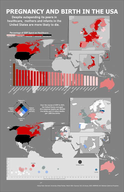
Pregnancy and Birth in the United States: Comparing Infant and Maternal Mortality Rates Across 29 OECD Countries, 2019-2021

Image
 

Proportional and Bivariate Maps

Image
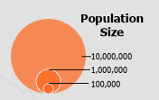
 Proportional and Bivariate Maps Representing multiple variables in a single design Proportional Maps Often we will need to represent quantitative data. Proportional (often called graduated) symbol maps are an intuitive method of displaying quantities. By using ratios, we can show a range of symbols to indicate quantity or importance. However, creating an effective proportional map can be challenging due to overlapping symbols and the human tendency to over or underestimate size.  The following map depicts the population size of major cities in India. I chose a proportional (or graduated) symbology of three sizes for this map. Circles are a common symbol for point classes and each circle represents a magnitude of class (population) size. Since humans have a difficult time discerning the differences between shape size, it is important to choose symbols that will be easy to interpret. Small, medium, and large are intuitive to most readers. The major challenge of this map was det...

Visual Storytelling

Image
Visual Storytelling  Presenting Information in Pictures Painting from the Lascaux Caves in Eastern France A star map was discovered among these 17,000 years old cave drawings (Photo from the French Ministry of Culture) Humans are innately a visual species. We look for patterns, demand order and balance, and cue into color. Readers come to the map with expectations and prior experience; they expect what is presented to them to follow conventional reading rules and patterns. By encoding our information in a visually hierarchical way, we provide structure and reassurance to the reader. Elements are ordered by importance and balance provides a pleasing aesthetic. Color plays an especially important storytelling aspect as color palettes tap into Jungian archetypes, emotional connotations, and affective expression. By combining hierarchy, color, and symbology, we can use cartography to tell an effective visual story. For this project, we were tasked to collect data from 2018 County Healt...

Playing with Color

Image
 Playing with Color It's a very serious business Creative Commons Oh, hello first grade color wheel. Why are you here? I thought we were in grad school? Oh, you're here to completely disillusion me from the notion that I know what color is? Cool. Color is an important aspect of cartography that often goes unnoticed by the majority of readers. However, color choice plays a critical, unspoken aspect of design and messaging. We can look at color through the Jungian lens: white is pure, red is bold and bloody, green is growth and life, and so on. The meaning of color is dependent on culture and historical trends.  But what about the scientific approach to color? Color is our human perception of the electromagnetic spectrum. We are seeing the absorption, reflection, and interference of light. Our interpretation of these wavelengths is affected by vision, light, and cultural understanding. Naming paint in the hardware store "Canyon Dusk" and "Moondust" is one way ...

Visualizing Terrain in ArcGIS Pro

Image
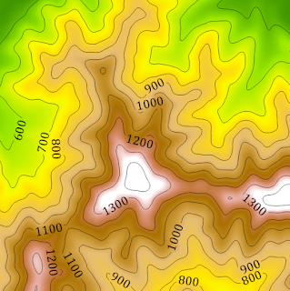
Visualizing Terrain in ArcGIS Pro Ever hear the joke about the topographic map? It was hill-arious! As stated in my last blog post, the world is not flat but traditional mapping is. So how do we go about translating 3D objects into a 2D space?  Terrain visualization is the process of representing either the physical characteristics of the terrain or phenomena occurring at that location. The goal is to provide a visual and intuitive understanding of a specific area's topography and landscape features. Frequently slope and elevation, rainfall, and landcover are recorded and symbolized in various methods. By combining recorded measurements with location and elevation, we can analyze possible patterns and make more accurate predictions.  Contour lines are lines on a map or a two-dimensional representation that connect points of equal elevation above a reference point, usually sea level. These lines help visualize the shape and relief of the land, indicating changes in elevation ac...