Posts

Creating Corridors

Image
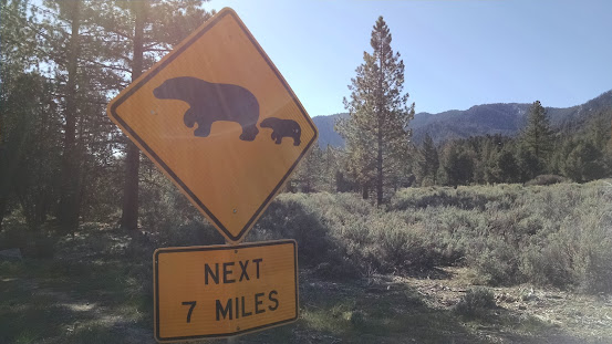
Creating Corridors: Multi-Path Suitability Analysis Creative Commons Background Wildlife corridors are a stretch of land where animals migrate from one location to another. They can be as small as a culvert or as wide as entire continents. As humans encroach on habitats, creating and maintaining wildlife corridors are vital to the preservation of animal species. In this hypothetical scenario, we have been asked to propose a wildlife corridor for black bears living in the Coronado National Forest.  Coronado National Forest encompasses a large swath of southern Arizona and New Mexico, consisting of eight "wilderness areas". Animals wishing to travel from one wilderness area to another will encounter human development. We can think of animal movement in terms of cost. Like humans, the bears will want to use as few resources as possible and minimize risk in order to travel.  Objectives For this project, we need to create a corridor. The corridor is the overlapping area between tw...
Assessing Suitability

Image
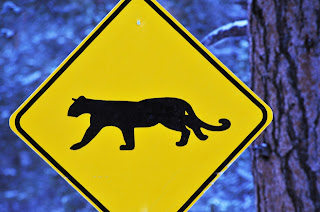
Suitability Analysis: Booleans in Vectors & Rasters An important product of GIS is identifying areas that fit a range of criteria. Where should the local city focus its limited resources? Where can ecologists find a rare species? How do we make the best choice when time and money are on the line?  In GIS, we can attempt to answer these questions with a suitability analysis, which provides a framework for picking "the best" locations for our needs.  Suitability analysis (also called a multicriteria decision analysis) consists of criteria and objectives, the corresponding layers, and a composite of all layers. In other words, there is a problem that needs to be solved, information related to that problem, and a system of making a final result that considers all of the required objectives. So what does that mean in the real world? For the following example, we were asked by wildlife experts to help create a map where mountain lions (cougars) could be located. For this object...

Assessing Storm Damage

Image
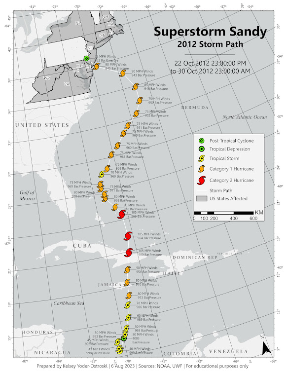
This week we continued exploring the aftermath of Hurricane Sandy by tracing its path in the Atlantic and inspecting just a small portion of the damage it caused.  By using NOAA data, we created a storm path map to illustrate Sandy's course as it began as a tropical depression, strengthened to a category 2 hurricane, and subsided into a post-tropical cyclone.  Next, we explored a small study area of 1 square mile off the coast of New Jersey and performed a damage assessment. Each property had to be identified and categorized using "domains". Each domain provides a dropdown menu of subtypes, which are pre-specified levels of damage. This is a useful tool for limiting the number of choices and reinforcing data integrity. Imagine telling a hundred people to describe thousands of buildings after a major storm. The responses would be wild! Overall, it is difficult to discern what damage has occurred and to what extent. A great deal of assumption was done on my part based on pe...

Coastal Flooding & Storm Surge Analysis

Image
     As climate change continues to intensify storms and increase flooding, it is vital for communities and governments to prepare for inevitable storm damage. In this week's lab, we explored coastal flooding models and prepared our own storm surge analysis. Our study area was Mantoloking, New Jersey, a low-laying barrier island that suffered major damage from superstorm Sandy in 2012. More information about the storm can be found on New Jersey's Department of Environmental Protection . Superstorm Sandy     By comparing LiDAR data before and a few days after the storm, we can create a comparison analysis. The LiDAR data is converted into a DEM by first creating a TIN (triangulated irregulated network). As the TIN shows, the topography varies little with only very mild sloping.  LiDAR .las point cloud dataset is converted into a  TIN       By subtracting the two DEMS, we can see the changes in the environment. Further color manipulat...

3D Visualization in ArcGIS Pro

Image
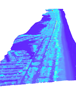
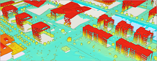
Through Esri's online courses, users can take unlimited lessons and learn a plethora of skills. ArcGIS Pro allows users to create, explore, and analyze data with 3D visualization. Below we will explore some of these 3D visualization techniques. All screenshots are from Esri's online training program or online tutorials. 3D Visualization Users can manipulate 2D data by converting it to 3D, allowing more realistic visualization. 3D representation of LiDAR data is used for measuring surfaces, which can then be converted into a digital elevation model (DEM) or digital surface model (DSM). LiDAR data As seen in the next screenshot, the produced DEM can reveal topography not seen by the naked eye. Here we can explore the features under the surface of the water. Other applications include mapping underground utilities and resources. 3D elevation An integrated mesh layer of photography or realistic textures can be draped over 3D objects to create a real-to-life representation. The ana...

LiDAR and Vegetation Density

Image
 LiDAR (Light Detecting And Ranging) is an exciting method of remote sensing where light in the form of a pulsing laser is emitted and measured to create highly detailed images. LiDAR is capable of penetrating through vegetation (or water) and measuring topography, including manmade structures. It is currently the most accurate method of creating digital elevation models (DEM). With LiDAR collected from USGS, we were able to create a DEM and a digital surface model (DSM), the latter containing manmade structures in addition to elevation. LiDAR can measure bare earth as well as surface features. Because we can measure both, we can create a map of tree height and use it to calculate tree canopy density. In the map below, we can see light-to-dark values which represent the lowest to highest surface values (in feet). The lightest values represent clear-cutting or manmade structures such as roads and campsites. The darkest values indicate the tallest trees. Density can be calculated by ...

Hot Spot Crime Analysis

Image
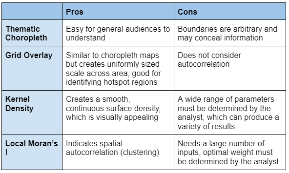
Hot Spot Analysis: Using Spatial Analysis Tools to Identify, Target, and Predict Criminal Activity Hotspot analysis is a spatial analysis tool that identifies areas of unusual density. There are many methods for identifying these clusters but the most common are thematic choropleth maps, kernel density, and Moran's I. Hotspot analysis is of particular interest to the criminal justice field as police departments and political leaders are interested in targeting areas with high crime rates. As demonstrated in the two maps below, how crime hotspots are represented can dramatically alter interpretation and future policy decisions.   Major Types of Hot Spot Analysis: Thematic choropleth Grid Overlay Kernel Density Moran's I Thematic Choropleth Mapping Grid Overlay Mapping First, the grid cells feature class was joined with the total number of homicides (2017), which provided us a joint count of homicides per cell. I exported only the cells containing one or more homicides to a new ...